- Aug. 19, 2019
- --
Powering your website with Accelerated Mobile Pages (AMP)
Today's web admins are all about site performance, especially on mobile. Site performance on mobile is something important to take into account since it will boost your conversion rate, session duration and even your ranking in web searches.
According to recent research, more than half of your visitors will leave your site if it takes longer than three seconds to load. This will mean more than half of your visitors won't see what you have to offer if your web pages are slow!
What does all of this have to do with AMP?
Well, AMP solves the performance problem on mobile, while at the same time providing a framework for delivering engaging, media-rich, and lightning-fast web pages. AMP means Accelerated Mobile Pages.
An AMP page won't be faster than a hand-tooled page if the latter is really well optimised. But AMP is about implementing best practices so anyone can have faster than average webpages.
How does it improve performance?
By constraining the HTML, CSS, and JavaScript that you can use in your web pages, along with optimised resource management and smart caching.
HTML-based, AMP pages will run in any web browser, out of the box. Additionally, AMP-HTML is designed so that it can also be served from the AMP Cache, and when it is, further optimisations can be automatically applied.
The AMP-JS runtime calculates page size and converts your custom AMP-HTML tags into HTML that the browser understands. It also assumes control of the loading of resources from the browser, so that it can prioritise resources that are likely to be viewed by the user.
When AMP pages are served from the cache, they can be optimised even further. These optimisations include:
Reducing page size by resizing images to match the user's resolution, minification of HTML and CSS.
Reducing HTTP requests by inlining images and CSS.
Reducing page load time by preloading components and pre-rendering web pages in the background.
Is AMP limited to newspapers and blogs?
AMP isn't limited to static text and blog type pages: rich and interactive pages can also be built. AMP pages can include animated menus, accordions, carousels, image galleries, light boxes, embedded videos, and more. They also support analytics and ad providers.
There are some big names like ebay using AMP for e-commerce, including a horizontally scrolling carousel that is used to promote products.
AMP has features that are enough to create shopping carts, forms, lightboxes, search and dynamic listing, etc.
Do I really need AMP?
AMP is just another distribution format, but to maximise your reach you might need to use as many channels as possible.
And even if your website is already tuned to perform really well you can still take advantage of performance gains via the AMP Cache and its instant pre-rendering.
Additionally, Google, Bing and Baidu are already indexing and promoting AMP pages in their search results.
Using AMP with a CMS: Magnolia
If you already have a website running on Magnolia or even if you are thinking of creating a website with Magnolia in the future, there are big chances you will need a mobile version of your site and possibly an AMP version of it.
AMP templates
The main thing you need is templates for these AMP pages, since AMP is slightly different from standard HTML. So at the very least you will need a standard page template and some component templates.
You can use as a base a light module that is already available from the community on npmjs which will provide you a basic page template with all required AMP tags, plus two components for adding rich text and images to your page.
In this post I will show you a standard page template with a similar structure and resources as the Travel Standard page template in Magnolia's travel demo.
Standard page template
Lets start with the main AMP layout:
standard.ftl
  <!doctype html>
<html amp lang="${cmsfn.language()}">
<head>
    [@cms.page /]

    [@cms.area name="htmlHeader"/]

</head>
<body>

      [@cms.area name="navigation"/]

      [@cms.area name="main"/]

</body>
</html>
Notice the code is the same as a traditional HTML page but additionally including an "amp" attribute. The main difference will be inside the head tags though:
htmlHeader.ftl
  <meta charset="utf-8">
<!-- include dynamically from theme or make templating function for it -->
<script async src="https://cdn.ampproject.org/v0.js"></script>
<script async custom-element="amp-sidebar" src="https://cdn.ampproject.org/v0/amp-sidebar-0.1.js"></script>
<script async custom-element="amp-video" src="https://cdn.ampproject.org/v0/amp-video-0.1.js"></script>
<title>${content.title!}</title>

[#if content.htmlPage?has_content]
    [#assign htmlLink = cmsfn.link(cmsfn.contentById(content.htmlPage))]
<link rel="canonical" href="${htmlLink}" />
[/#if]
<meta name="viewport" content="width=device-width,minimum-scale=1,initial-scale=1">
<style amp-boilerplate>body{-webkit-animation:-amp-start 8s steps(1,end) 0s 1 normal both;-moz-animation:-amp-start 8s steps(1,end) 0s 1 normal both;-ms-animation:-amp-start 8s steps(1,end) 0s 1 normal both;animation:-amp-start 8s steps(1,end) 0s 1 normal both}@-webkit-keyframes -amp-start{from{visibility:hidden}to{visibility:visible}}@-moz-keyframes -amp-start{from{visibility:hidden}to{visibility:visible}}@-ms-keyframes -amp-start{from{visibility:hidden}to{visibility:visible}}@-o-keyframes -amp-start{from{visibility:hidden}to{visibility:visible}}@keyframes -amp-start{from{visibility:hidden}to{visibility:visible}}</style><noscript><style amp-boilerplate>body{-webkit-animation:none;-moz-animation:none;-ms-animation:none;animation:none}</style></noscript>


<style amp-custom>
    [#include "/travel-demo-amp/webresources/css/styles.css"]
    [#include "/travel-demo-amp/webresources/css/sidebar.css"]
</style>
There are some things like the link rel=cannonical and css files that will be explained further in sections below.
The navigation area will also be a bit different, since it's using the amp-sidebar extended component (included as a external script in the header).
navigation.ftl
  [#include "/mtk/templates/macros/navigation.ftl"]
[#assign navigationRootPage = navfn.rootPage(content)!]

<header class="headerbar">
    <div role="button" on="tap:sidebar1.toggle" tabindex="0" class="hamburger">☰</div>
    <a href="#">
        <amp-img class="home-button" src="${ctx.contextPath}/.resources/travel-demo-theme/img/logo-white.png" width="210" height="30"></amp-img>
    </a>
    <div class="site-name">${content.title!}</div>
</header>

<amp-sidebar id="sidebar1" layout="nodisplay" side="right">
    <div role="button" aria-label="close sidebar" on="tap:sidebar1.toggle" tabindex="0" class="close-sidebar">✕</div>
[@navigation navParentItem=navigationRootPage depth=1 expandAll=true navClass="sidebar" /]

</amp-sidebar>
As you can see, the area is using mtk and navigation templating functions so vey little code is needed to have a working navigation sidebar:

Finally lets take a look at the template definition:
standard.yaml
  title: (AMP) Travel Standard
templateScript: /travel-demo-amp/templates/pages/standard.ftl
renderType: freemarker
dialog: travel-demo-amp:pages/standard
visible: true
areas:
  htmlHeader:
    createAreaNode: false
    renderType: freemarker
    templateScript: /travel-demo-amp/templates/pages/areas/htmlHeader.ftl
    type: noComponent
  navigation:
    createAreaNode: false
    renderType: freemarker
    templateScript: /travel-demo-amp/templates/pages/areas/navigation.ftl
    type: noComponent
  main:
    templateScript: /travel-demo/templates/pages/areas/contentContainer.ftl
    type: list
    parameters:
      cssClass: container
    availableComponents:
      jumbotron:
        id: travel-demo:components/jumbotron
      linkList:
        id: travel-demo:components/linkList
      teaser:
        id: travel-demo:components/teaser
As you can see, the definition is very similar to the travel's demo standard page definition. It's even using some of the travel components. This is possible because AMP accepts most HTML standard tags, so jumbotron, linkList and teaser (with no image) can be used.
Video component template
Standard HTML video tag is forbidden in AMP, so AMP provides its own amp-video tag. Lets see how can this be implemented in a template:
video.ftl
  [#-------------- INCLUDE AND ASSIGN PART --------------]
[#include "/mtk/templates/includes/init.ftl"]

[#-- CSS default --]
[#if !divClass?has_content]
    [#assign divClass = "video-container"]
[/#if]

[#assign layout = "layout='responsive'"]

[#assign video = damfn.getAsset(content.source)]

[#assign videoTitle = ""]
[#if video.title?has_content]
    [#assign videoTitle = video.title]
[/#if]

[#assign assetType = video.mimeType]
[#assign videoSrc = video.link]

[#if content.assetposter?has_content]
    [#assign assetPoster = damfn.getAsset(content.assetposter)!]
    [#if assetPoster?has_content]
        [#assign poster = 'poster="${assetPoster.link}"']
    [/#if]
[/#if]


[#-------------- RENDERING PART --------------]
[#-- Rendering: video item --]
<div ${divID!} class="${divClass}">
    <amp-video width="${content.width!480}" height="${content.height!270}" ${layout!} ${poster!} ${content.autoplay?string("autoplay","")} ${content.controls?string("controls","")} >
        <source src="${videoSrc}" type="${assetType}">
    </amp-video>
</div><!-- end ${divClass} -->
Where the dialog is:
video.yaml
  form:
  tabs:
    - name: tabMain
      fields:
        - name: source
          required: true
          class: info.magnolia.ui.form.field.definition.LinkFieldDefinition
          targetWorkspace: dam
          appName: assets
          identifierToPathConverter:
            class: info.magnolia.dam.app.assets.field.translator.AssetCompositeIdKeyTranslator
          contentPreviewDefinition:
            contentPreviewClass: info.magnolia.dam.app.ui.field.DamFilePreviewComponent
        - name: autoplay
          class: info.magnolia.ui.form.field.definition.CheckboxFieldDefinition
          defaultValue: false
          type: Boolean
        - name: controls
          class: info.magnolia.ui.form.field.definition.CheckboxFieldDefinition
          defaultValue: true
          type: Boolean
        - name: poster
          class: info.magnolia.ui.form.field.definition.LinkFieldDefinition
          targetWorkspace: dam
          appName: assets
          identifierToPathConverter:
            class: info.magnolia.dam.app.assets.field.translator.AssetCompositeIdKeyTranslator
          contentPreviewDefinition:
            contentPreviewClass: info.magnolia.dam.app.ui.field.DamFilePreviewComponent
        - name: width
          class: info.magnolia.ui.form.field.definition.TextFieldDefinition
          required: true
          label: Width
        - name: height
          class: info.magnolia.ui.form.field.definition.TextFieldDefinition
          required: true
          label: Height

actions:
  commit:
    class: info.magnolia.ui.admincentral.dialog.action.SaveDialogActionDefinition
  cancel:
    class: info.magnolia.ui.admincentral.dialog.action.CancelDialogActionDefinition
Another important forbidden tag is the img tag but this component is already provided by the npm module mentioned before.
CSS styles
In AMP, you can't use external css files for styling your webpage. This means you need to add inline styles with the style amp-custom tag. You may have noticed this was already included in the standard page template:
standard.ftl
  <style amp-custom>
    [#include "/travel-demo-amp/webresources/css/styles.css"]
    [#include "/travel-demo-amp/webresources/css/sidebar.css"]
</style>
The content of the css files manually included contains standard css code with an exception: You need to remove any !important qualifier inside your styling. There are some other restrictions listed here.
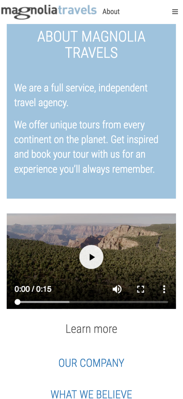
Using similar styles as the travel demo, you can achieve an AMP version of the about page:
Link rel tags
When you create an AMP version of an already-existing website, both should be linked.
This means that every HTML page will need a link to the matching AMP page:
htmlHeader-amp.ftl
<link rel="amphtml" href="${ampLink}"> Additionally the AMP page needs to link the matching HTML page with a canonical link:
htmlHeader.ftl
<link rel="canonical" href="${htmlLink}"> These could be configured manually by a dialog field or dynamically obtained from page variants. We will explain further in the next section.
One or multiple trees
There are basically 2 ways of providing AMP pages of your website:
Different trees with different layouts/templates/components. One tree contains HTML pages and the other tree contains AMP pages only. This way can be used when you have a rich website for desktop/mobile and a another website, possibly with simpler structure for AMP distribution on search engines. This way could be used, for example, by e-commerce or custom made websites in AMP.
One single tree with only one structure for all channels of distribution, which means HTML for desktop, HTML for mobile and AMP when needed. This way can be used when only few pages of your website need AMP distribution. This is commonly used by newspapers where only the news detail page has an "AMP variant". This will also apply with any other kind of page which is serving different contents, like news, products, etc.
For the first case, different trees, you just need a field in the page's dialog to link the AMP version of the page. For the second case, you can use personalisation variants to set this automagically.
Using personalisation for serving AMP pages
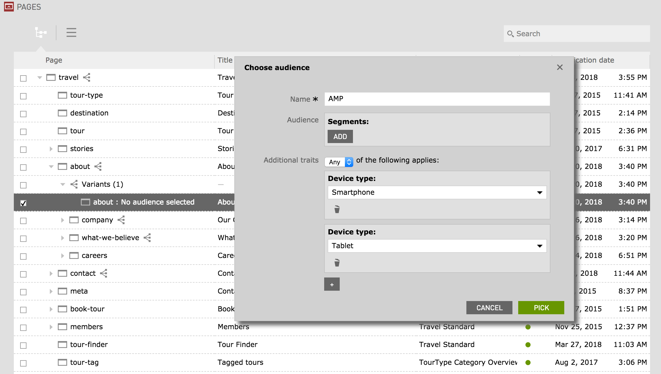
Personalisation is used to serve different versions of a page to the user based on traits. This mechanism can be easily used for serving AMP versions of an HTML page in a single tree website if you use the user's device as a trait and create a variation for smartphone & tablet audience.
Magnolia already provides a module for device detection so this trait can be easily implemented, but if you don't want or know how to make custom traits, you can find a device trait module here.
Once you have traits for smartphone/tablet, it's as easy as creating a variation of your page using "Any" of these traits:
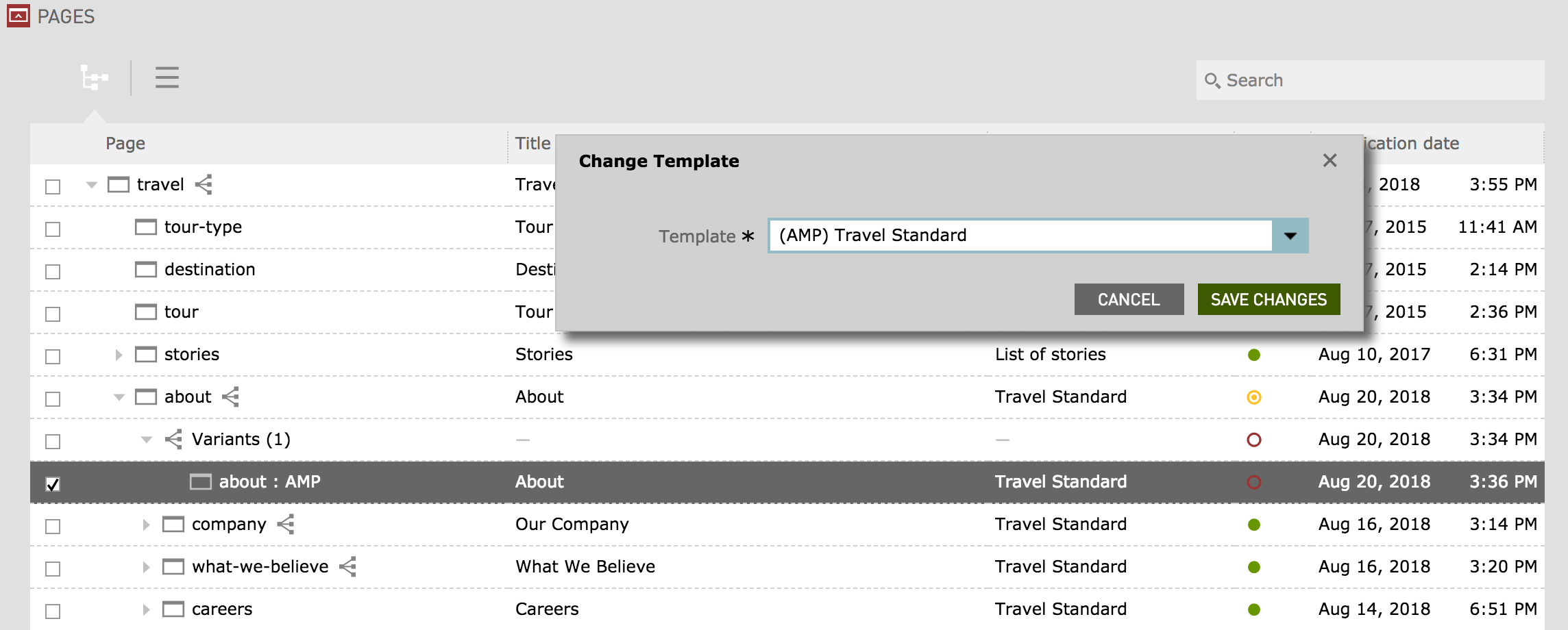
And then changing the template of the page to an AMP template:
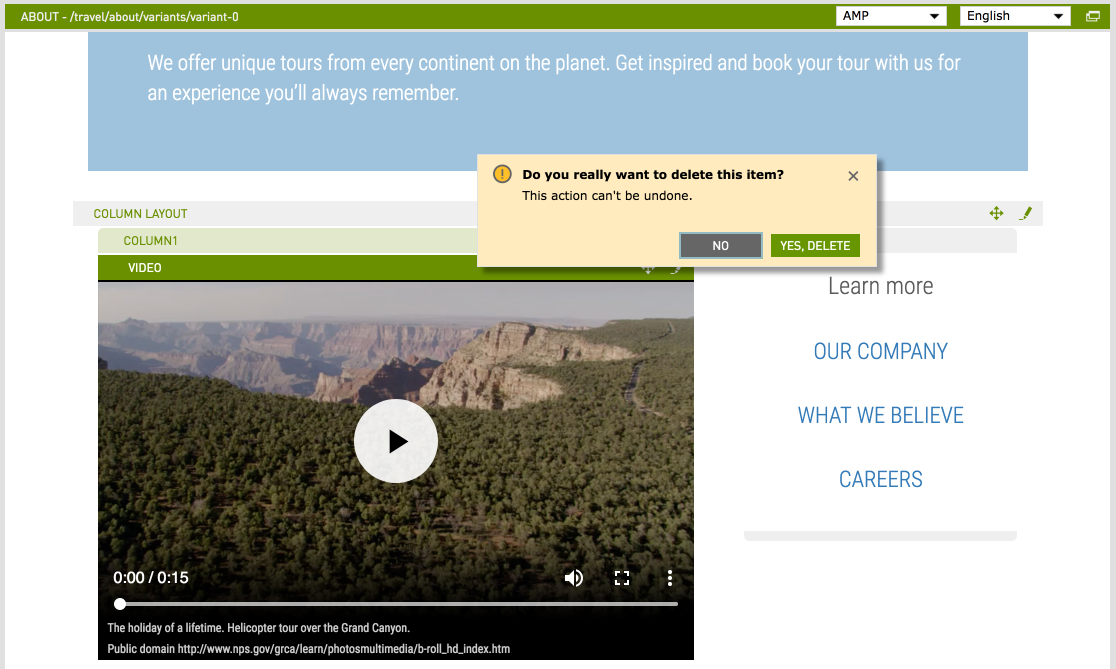
Finally, you might need to change your page contents if not-allowed elements like image or video are present. In this case we will remove the video component:
Add an amp video component instead:
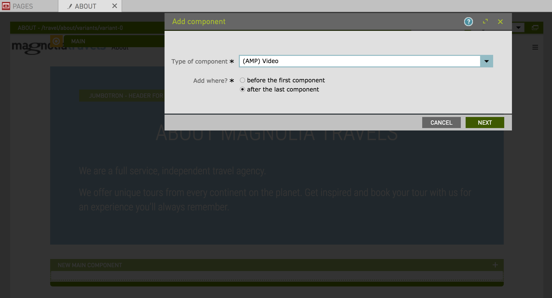
And simplify the layout by removing the columns:
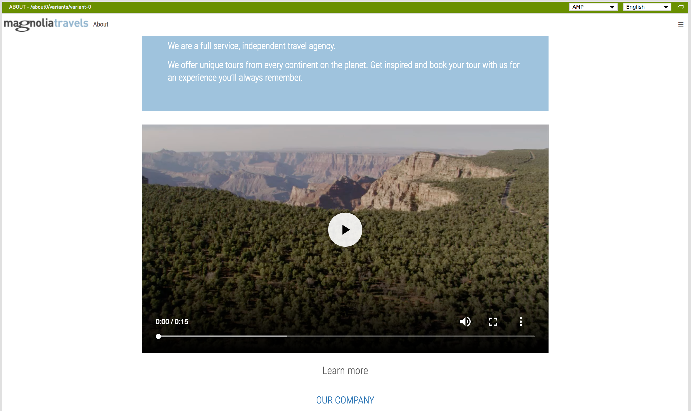
Notice that you don't need to worry about internal links like "Our Company" since this page could also have an AMP variant and the link won't need to be changed: personalization will take care of serving the right version according to the user's device.
Travel demo in AMP
Finally, here you can find a module implementing the strategies described in this article in order to have AMP versions of the travel demo. (Note: this module is just a POC and shouldn't be used as it is for real projects.)


